A much better tool for Fitness, Fatigue and Form
Verify and personalise
Why Fitness, Fatigue and Form usually miss the mark
The classic version of Crickles had a FitFat page, showing Fitness, Fatigue and Form curves, as well as a related Fitness Trend page that showed smoothed annual fitness curves overlaid for each year of available history. These were amongst Crickles’ most visited pages and addressed one of the main problems with implementations in other apps: consistency of measurement. For example, for any activity where the user is not wearing a heart rate monitor or using a power meter, apps such as Strava score the Fitness and Fatigue impact of the session as zero. Crickles, by contrast, uses machine learning models to estimate cardiac stress (CSS) in the absence of heart rate data and CSS is the consistent metric from which Fitness, Fatigue and Form are calculated.
However, this still does not address all of the problems with Fitness, Fatigue and Form metrics. These are:
- It is assumed that all people respond to exercise in the same way over the same timeframe, which is very questionable and not convincingly shown in any robust studies.
- There is no way to test the predictive value of the fitness, fatigue and form values shown in most apps.
- If an app user believes that their response to exercise is different from the model assumptions there is no way for them to personalise the calculations to reflect this belief.
Without addressing these issues, while a smoothed Fitness curve, such as the old Crickles Fitness Trend, might indicate the general shape of fitness over a long period, the accuracy of fitness, fatigue and form metrics and their utility for predicting peaks of form is absent as they are not trained on the user’s data.
Given that all of the other methodologies in Crickles are solidly data-driven, we have held off re-introducing FitFat into the new version of Crickles until these problems were addressed. Now they are.
Calculating Fitness, Fatigue and Form
The basic concept of the calculations is that every piece of exercise has two effects:
- An increase in fitness, which decays slowly;
- An increase in fatigue, which decays quickly.
The Fitness curve is then the sum across time of the declining fitness impacts of each activity and the Fatigue curve is the sum of the more rapidly declining fatigue impacts. Form at any point in time is simply fitness minus fatigue.
This makes heuristic sense and enables us to chart how periodisation in training works and to see, for example, the benefit of a rest period before a targetted race or event. The problem lies with the rates of decay. Decay is taken to be exponential for both fitness and fatigue and the rate of decay can be expressed as the number of days it takes for the impact of an activity to fall by around two thirds (more precisely, \(\frac{1}{e} \approx 36.8\%\) is left). The values commonly used are 42 days for fitness and 7 days for fatigue. This means that the fitness benefit of a training session is down to around a third of its initial value after 6 weeks and the fatigue cost is down to around a third after one week.
Why these numbers? How much do they vary by person? What if I’m a fast or slow recoverer? How can I check that these values are right for me? How can I change them if I think they aren’t?
Using the Crickles FitFat page
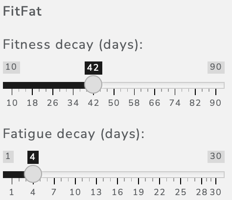
On the FitFat page you can choose whether to show Fitness, Fatigue or Form using the Metric drop-down. Until you save your own preferences (see below) each of these charts is initially calculated using the default decay values of 42 days for Fitness and 7 days for Fatigue. These can both be adjusted using sliders:

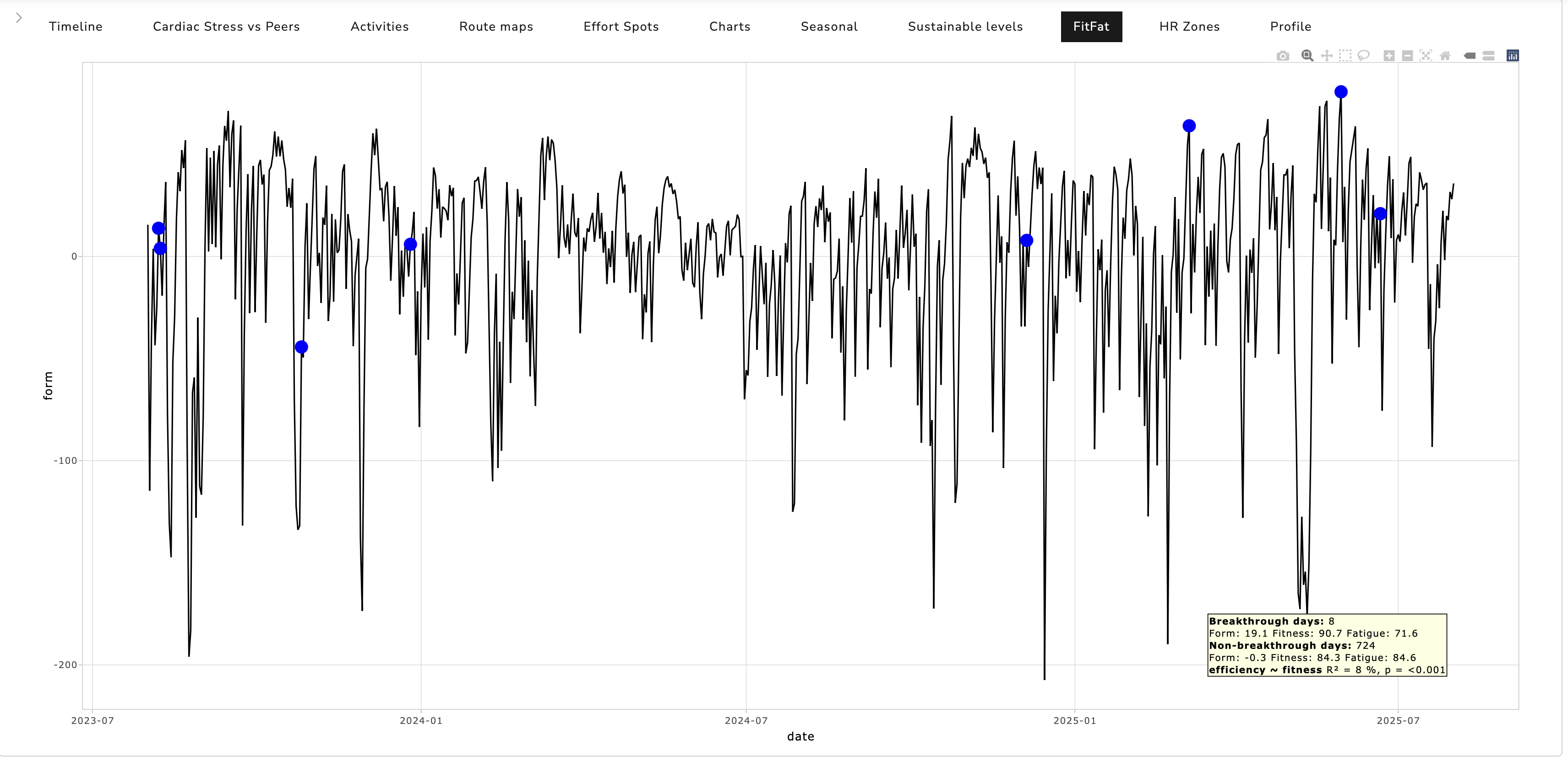
As you modify the decay values you will instantly see the charts change (assuming relevant - changing the Fitness decay value won’t affect the Fatigue chart, or vice-versa). Here’s an example showing the Form chart:

The time horizon over which the charts extend is limited to the past two years (as shown in this example). Over longer periods the physiology of the individual is likely to change - if for no other reason than aging - and it will become harder to find decay factors that give a good fit to the data.
Choosing good decay values
One way to choose good values for the Fitness and Fatigue decay days is to experiment and see which values generate curves that best correspond to your experience. There are two particular questions that can help to frame this:
- Do the days when you were performing best fall at high points on the Form curve? Conversely, when you had off days was your Form low?
- Does the line of the Fitness curve track your experience of ease and performance while riding and/or running?
If you cycle and use a heart rate monitor and a power meter both of these questions can be quantified. For the Form test, we look at breakthrough days. On every ride with a power meter Crickles forms an assessment of what your sustainable power is judged from that ride alone. This is shown as Spot_Power on the Activities page. Often you will be cycling way below threshold and this, as an individual data point, won’t mean much. However, by taking all of your Spot_Power values together Crickles can estimate your prevailing sustainable power; this is shown as Sustainable_Power on the Activities page and is what is charted on the Sustainable Levels page. In general, this follows the methodology for calculating sustainable heart rate as described here. A breakthrough day is one on which you have a ride that increases Crickles’ estimate of your sustainable power, which is to say that your power exceeded in some way what you’ve put out over the previous weeks. On the Fitness, Fatigue and Form charts these breakthrough days are marked with blue points and if you hover over one you’ll see the name and date of the activity that constitutes the breakthrough. An example is shown on the previous chart (“Breakthrough: Ramp”).
If the Form curve is telling you anything meaningful the average Form on breakthrough days should be significantly higher than the average on non-breakthrough days. On the example above, where the decay values have been optimised using the sliders, the annotation in the lower right of the chart shows this:

We see that there are 8 breakthrough days with an average Form of 19.1 and that there are 724 non-breakthrough days with an average Form of -0.3. Clearly, the average Form on the breakthrough days is substantially higher. We can also see that this is due to Fitness being higher (90.7 vs 84.3) and Fatigue being lower (71.7 vs 84.6) as we’d expect. By eye, we can see on the chart that the blue breakthrough days do indeed tend to fall on peaks of Form and the average values confirm this: the answer to our first question above is provably Yes.
The second question - does the Fitness line track ease and performance while riding - offers a better statistical test because the relevant data points are dense, which is to say that (almost) every ride gives us an equally useful sample, unlike the breakthrough test, where we’re most interested in a relatively few points. (The reason that it’s “almost” every ride is that we ignore rides with a very low heart rate intensity.) Here we use a measure of efficiency that leverages our nice methodology for calculating spot power and spot heart rate: efficiency is the ratio spot_power/spot_hr. This tells us how much power we’re generating for a given cardiac effort. If the Fitness measure is good then it should be securely associated with efficiency - that’s simply a measurable way to express our second question.
We test this by modelling efficiency as a function of Fitness, which is what efficiency ~ fitness means. We get two values from the model. One is the p-value, which tells us how likely it is that the observed relationship between efficiency and Fitness is down to chance. The lower the p-value the less likely the relationship is to be random; a p-value of < 0.05 is generally taken to be “significant”. Here we see a p-value of < 0.001. This tells us that there is essentially no chance that the relationship between efficiency and Fitness is random.
The second value from the model is the R-squared value. This tells us how much of the variation in efficiency can be explained just by pegging it linearly to Fitness. We know that this will always be partial at best. There are many factors that could affect efficiency on a particular day such as sleep, stress, caffeine, alcohol and non-measured exercise such as walking or housework. Also this test will understate the percentage explained if the relationship between efficiency and Fitness is real but non-linear. We see in the example that we have an R-squared of 8%, which is to say that we can account for 8% of the variation on spot_hr/spot_power from a simple linear relationship with our Fitness curve. The combination of a very low p-value and a meaningful R-squared value tells us that the Fitness curve is indeed tracking our ease and performance in some measurably meaningful way.
So, to optimise the decay days settings you experiment with the sliders until you find values that are consistent with what you believe sounds right for you - for fatigue, do you think it takes a week to recover from a ride or a run or would fewer or more days feel more appropriate? - and also look at the stats. In the example above the default settings of 42 days for Fitness and 7 days for Fatigue gave this:

We see that the difference in Form between breakthrough and non-breakthrough days is substantially narrower than with the optimised values shown above and that Fitness is accounting for much less of the variation in efficiency (5% vs 8%).
If you do not ride with a power meter and a heart rate monitor you can inspect the curves by eye for correspondence with your experience, which is something, but these statistical tests will not be available.
Saving your preferences
Once you have found settings for decay values that you like you can save them using the Save Prefs button. This will also save the curve (Form, Fitness or Fatigue) that is currently selected to be the default when you open the page in future.